Note that a lot of these ideas have found their way into Database Backed Web Sites and are presented in a more organized fashion there.
Kill a pile of birds with one stone by getting Adobe Distiller, a product that automatically converts PostScript to PDF files that may be viewed with the Adobe Acrobat reader. Despite being a total Windows Caveman, I installed the Windows version on an NT box with one mouse click and about two minutes of waiting time. It took me 30 seconds to convert two PostScript files and the resultant PDF docs were one third the size of the originals. Great software, available for Mac, Windows, and various brands of Unix poison. Distiller comes packaged as part of Acrobat Pro.
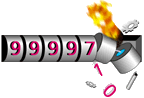 You could put a big headline on your site saying "this page gets
almost no traffic." Alternatively, you can just add one of those
little GIFs that counts the hits. Face facts: if you have 200,000
hits/day then neither you nor any of the public services is going to
want to spend the server resources to generate all of those little
GIFs. If you don't have 200,000 hits/day, then why advertise the
fact?
You could put a big headline on your site saying "this page gets
almost no traffic." Alternatively, you can just add one of those
little GIFs that counts the hits. Face facts: if you have 200,000
hits/day then neither you nor any of the public services is going to
want to spend the server resources to generate all of those little
GIFs. If you don't have 200,000 hits/day, then why advertise the
fact?
If you can't live without the hit counter, then at least put WIDTH and HEIGHT fields on the IMG tag so that users don't have to wait (see above) for the text below the counter.
The latest Unices often contain comprehensive rewrites of the network code.
Client-side image maps have solved the user interface problem and they are backward compatible with older browsers. If you have any imagemaps on your site, you should add a client-side map to the HTML file.
If you don't feel like maintaining your own full text index, you can actually sleaze off Altavista, Lycos, or whatever. You just write a CGI script that processes your own form and redirects to AltaVista, adding an advanced query syntax in front that restricts the search to your host. My friend Leigh figured this out and uses it on his site.
You can smoke out your dead internal and external links by running a spider against your site. This is what www.webcrawler.com is doing to the whole Web. You want to do the same thing, but only go 1 level deep outside of your server. If you're running the mighty AOLserver, then you just need this program that Jin and I wrote. If you are benighted, then you'll need to inspect this whole pile of spider programs (I'm not sure which is the easiest to use).
Try Not to Force Your Format on User InputSome people are more comfortable entering the spaces or hyphens they see in their credit card number (it's easier to read and verify that way), don't like parentheses around their area code, want to enter their Zip+4 not just their Zip code to help the post office out, and many other things that Web site form force on them. Your internal format and the way you display it is up to you (although maintaining the users' original format for at least their verification is better), and once the spaces are removed by you the credit card number has to be numeric, but try to only force how data is entered when it is absolutely necessary.
Never Throw Away User Input
After they've entered it the way they like, there's nothing worse than throwing it away because they entered something incorrectly.
For example, you fill out a lengthy credit and address form, send it, are told something wasn't numeric that has to be, and to hit "Back" to correct it. You hit it, discover the whole form has been blanked out, and decide maybe you don't want to buy that after all.
-- Fred Ballard, March 2, 1998
Just a quick note about PDF files: users of Unix variants not supported by Acrobat Reader can still view PDF files by using xpdf from ftp.x.org, or by converting to postscript using later versions of Ghostscript.
-- Jim Wise, March 31, 1998
Actually ghostscript (5.0 and up) can convert postscript to pdf beautifully. If you are going via latex->ps->pdf, make sure that you use postscript fonts though. The resultant pdf will be much smaller.
-- Ramarao Kanneganti, April 8, 1998
Instead of setting your page's background color to white(#FFFFFF), set it to off-white( or whitesmoke, #EFEFEF). Pure white tends to bleed into other colors on TV output (e.g. WebTV).
-- Brian Baquiran, August 21, 1998
I am not sure that defining only text and background colour is the way to go. If I have set my graphical browser to display all links in white and you have set the background white, I will miss all the links on a page. Either set all colours or none. If you want to keep a consistent interface, by using the colours that a large portion of the web uses by (browser) default, then hard code all the colours.
-- Branko Collin, September 7, 1998
Don't Assume that Everyone is an American
This is important if you're selling something.
- Not every country uses the same number of digits in their phone numbers.
- Not all zip codes (called postal code in some countries) have the American format.
- Not every country is divided into states(!).
Don't Use Long Option Menus
Some sites let you select the country you live in from an option menu with several hundred entries. This requires lots of manual dexterity, and on most Unixes (I don't remember how it is under Windows and Mac) the cascaded menus will appear on top of each other when reaching the right border of the screen.
Why is that a problem? Because the "more" item at the bottom usually will appear at the same place as the "more" item in the next cascade, thus popping up all the cascades which exists!
Instead you could use a list box, where one can scroll down to the appropriate section. Or let people write in plain text the country, and then checking that against probable matches, and then presenting the probable matches on the next page.
-- Paul Kenneth Egell-Johnsen, July 7, 1999
Add 'ALT' tags to ALL your images. If there is no alternative text that makes sense, use alt="" - this will help text-only browsers more than you will believe.Don't use 'ALT' text like 'GIF image, 14Kb'. It's no help to anyone.
-- Bruce Coker, September 12, 1999
Don't require your users to download a plugin unless they are strongly committed to using your site (otherwise they will realize what a hassle it is and leave) and unless you really can't provide that functionality without the plugin. Most plugins are a drag to download over a slow connection, may ask the user to reboot their machine, may crash the browser, may crash the OS and are only easily available for Windows and MacOS.
-- Lucas Gonze, September 19, 1999
Eliminate all Java applets unless you really, really, really have a need for it/them. Nothing infuriates me more (well, a few things do) than to spend ten minutes trying to start a page's Java applet, possible crashing my browser and CPU (especially since the big two browser's Java implementation on Mac's is less than ideal right now) only to find it's for a chintzy little scrolling message image that says something timely like "Dewey Defeats Truman."
-- phil gavenda, November 20, 1999
Don't use Java for navigation menus
Nothing ticks me off more then to have to wait for the stupid java application to download just to go where I want. That is unless the java applet crashes, or just plain doesn't run because they didn't bother to test it. You you absolutely have menus with that "hover" effect, use JavaScript (so I can disable it on my side).
-- Derek Dysart, December 7, 1999
I had mentioned an excellent external free site-search program for people who don't run their own servers. The limit is 5,000 pages (vs others' 500 pages). This one has NO ads and it even offers boolean searches and other advanced options. I have no idea why they do this. Also, it doesn't use javascript and is faster.
It's Texis, at Thunderstone, and their webpage for that is here.Since the time I found and wrote about them, I've come across www.atomz.com which indexes only up to 500 pages but which has an advanced option that's easier for users and which also indexes results of cgi runs.
It doesn't do boolean searches but sort of emulates them in a limited way which is easy-to-use. Results are much more detailed, showing you context for each page.
Also it lets you re-index your site at anytime while Thunderstone Texis' is allowed only 8 hours apart. I've decided to keep the atomz.com one on my umbrella site, at the top of my page for those curious what it is like. - Andrys
-- Andrys Basten, May 8, 2000
90% of users work on a 14" monitor. Always try to work to the resolution of a smaller monitor.
-- AARON DAVIS, September 6, 2000
In addition to the many useful tips here, I'd like to suggest that most pages should have a "first presented" or "last updated" date.Some pages should have both. This can be in some "cheap" real-estate - maybe near the footer.
While reading your site, I was surprised to find references to the new Netscape 1.1 browser, for example. I just graduated from using the 6.0 version to Mozilla.
Particularly, with advice and howto pages, I really value a quick hint at how current the data is likely to be. I don't necessarily depart old pages, I just make sense of them more quickly.
-- Robert Mackie, October 8, 2001
Be military-friendlyMilitary members often have addresses that are part of the military post office system. They usually look like this:
Name
Street address
APO, AE 12345
where "APO" is the "city" (really stands for "Army Post Office"), and "AE" is the "state" (can be anything, this, I think (not sure), is Europe).
-- Jeremiah Moss, December 11, 2002
As you are emphasing on broken links, I would like to tell about Dead Links, a link cheker spider I've developed. Hope you like it.
-- Mario Carbonell, January 18, 2004
One of the most prevalent mistakes that I see in website design lies in the area of navigation and user-friendliness. Some tips on navigation: - Make sure that wherever your visitor is in your site, they can get to any other area - Make sure they know where they are!! If you have a deep site with lots of internal pages, I suggest placing a "You are Here" ICON with a path back to the top. This is sometimes known as "Breadcrumb navigation" - Readability. I sometimes see heroic graphical feats in navigation buttons, but ... bummer I can't read them .. or they are so loud and distracting that I can't concentrate on page content. - Be honest about your content. Don't mislead a visitor into going to a page on your site and disappoint them with content unrelated to the link text.
-- Outdoor Decor, March 20, 2004
Another useful feature is an XML Sitemap. It helps search engines see when some page deep on your site has changed. (See Google Webmaster Tools for info on how Google uses the sitemap.)
My sitemap-o-matic script will build a sitemap and also notify you of broken links and other site errors, and which pages on your site link to the pages with errors. (Run it from cron and you get the report in your mail.)
-- Don Marti, September 8, 2008
You should most definitely add a site search to your site. This will allow users to search your entire site easily and quickly. You can use http://www.BuildaSearch.com and use their "copy and paste" feature to add a free site search to your website.
-- stephanie Jones, January 10, 2009
I like the hit counter because i have google adsense on many of my sites and it helps me keep track of how well certain sites are doing when compared to others..i think you will find thats the whole purpose of having one.
-- edrwq ewfwa, August 23, 2009
The most frequently-asked questions are noted, and in many cases ANSWERS ARE GIVEN! (contributed by George Girton)